The Story Behind the New Welcome to Squamish MuralSeptember 30, 2020News
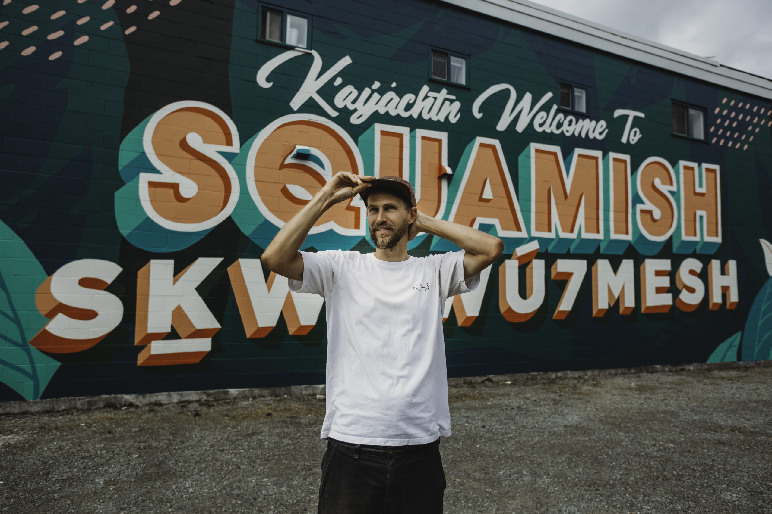
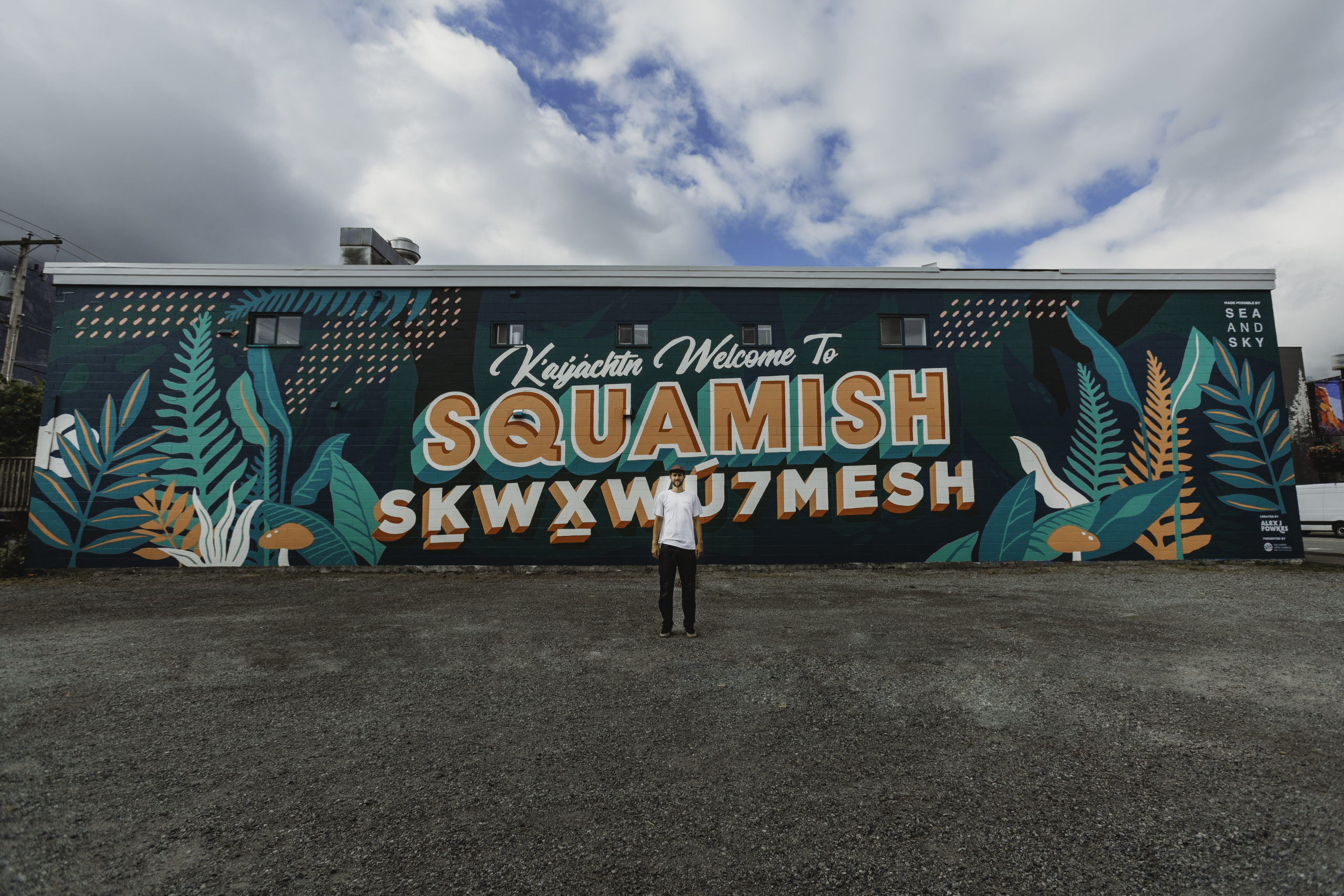
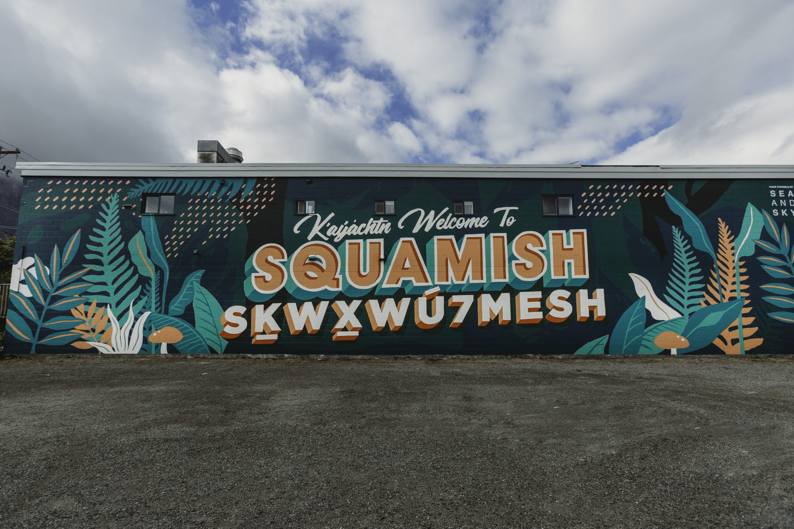
You may have noticed a bright and colourful mural welcoming you to Squamish as you enter our downtown core.
The idea behind this piece of art that proudly sits at Cleveland and Pemberton Avenue welcoming everyone that passes by in both Squamish and English languages was brought to fruition by local artist, Alex Fowkes. Alex is an award-winning British designer, predominantly known for his unique typographic work, installations and murals. He has called Squamish home for the past 5 years.
One of our Downtown Squamish Board Members, Robyn Kelly, recently sat down with Alex Fowkes, to ask him a few behind the scenes questions about this project:
- How did this project initially come about and why?
I have been living here in Squamish for coming up to five years now and have been looking at this wall since then thinking how great it would be to have a mural featured here. It’s the biggest, cleanest, and the first thing you see when you enter downtown. I’ve been floating the idea around with friends, colleagues and various other people for a while now. I always wanted it to be a big Welcome to Squamish featuring both English and Squamish languages.
Then, due to Covid, The Squamish Arts Council’s annual Wind Festival for the Arts was reimagined as a socially distant festival and this created the space to bring this idea to life as part of the festival. I started to work closely with Kat Matthews, a Squamish Arts Council board member, who spearheaded the project and was able to help turn my ideas into a reality.
- Can you tell us what your design process looked like?
There was a lot involved with designing this, so much to consider. When I’m doing big murals, I like to consider the surroundings, where the main viewing points are, and any interesting features on the wall itself. This location has Jessa Gilbert’s mural featured on the next building which is based on more of an alpine view. I really liked the idea of making mine more of a treeline and lower influence so that as you drive by you go from treeline to alpine. I never wanted any human elements involved in this mural, purely the nature that surrounds us.
Featuring both English and Squamish language here was really important so we consulted with a Squamish Nation language expert on the translation, but also sought approval of the design. We chose to feature Ḵ’ay̓áchtn first which is “welcome” followed by “Welcome to” in English. Skwxwú7mesh is featured below Squamish to represent the foundation upon which ‘Squamish’ was built. Also, a conscious decision was to feature the peach colour of the Skwxwú7mesh lettering inside the letters of Squamish. I wanted to represent the collaboration and connection as much as possible.
Colour-wise I wanted to keep the colours quite green and representational but also have some poppy colours on those (multiple) grey days in Squamish so that mural still brings colour and life to the space.
- Do you have any future plans for the mural or this wall?
I’m super happy with how the mural is currently but there are always ways to improve and expand, especially with more time. While we worked closely with the Squamish Nation on both the translation and the production of the mural, I’d love to deepen that relationship in a future collaborative design. We have an agreement with the building owner to use this wall for 5 years and once that is up, we’ll be ready for a refresh. The design of this mural was my own, so in the future, I would like to develop a design together that merges styles and techniques for both the design and production stages. I think the mural as it is today has the opportunity to become a Squamish landmark and look forward to seeing its evolution over time.
- Who are the sponsors and how hard was it for you to get people on board to make this vision you had come to life?
Everyone was so supportive of the project, even during production we had multiple people say how happy they were to have something this vibrant and exciting to welcome you to town. I think now that the vision exists it will be easier to get people more excited about projects like this.
The project was primarily made possible by Sea and Sky and we’re incredibly grateful to them for seeing this vision and supporting the project. We also received some fantastic donations and help from Downtown Squamish, Dulux, Sabre Rentals, Goodbye Graffiti, Nester’s Market, Sunny Chibas, Sunflower Bakery, and Wind Studio.
I want to thank some special people that helped make this project possible. Everyone involved from Sea and Sky, Kat Matthews and Amy Liebenberg from the Squamish Arts Council, Deanna Lewis, Siobahn Joseph: Gyauustees from the Squamish Nation, the whole production team, volunteers, and all the sponsors.
When you snap your pictures of this mural be sure to tag Artist: Alex @alexjfowkes. Plus, use #downtownsquamish for a chance to be re-posted to our Instagram @downtownsquamish. The @squamishartscouncil deserves tags too for the management support of this project!
Photos by: Angela Bliss Photography


